
 At first glance, the Washington Environmental Health Disparities Map on the Department of Health’s website, shows many odd-looking shapes, in shades of purple, tan and blue. The shapes are communities across our state and the colors are how they compare with each other for environmental health issues.
But who created the map? What’s the story behind it?
The story behind the map is one of grass-roots collaboration, across various agencies and organizations. It’s a story about mapping the issues near and dear to the hearts of the people behind it, and of those who are affected by environmental health issues. The initiative behind the map started with an organization called Front and Centered, a statewide coalition of organizations and groups for communities of color and people with lower incomes whose mission is to work toward environmental justice.
“For us, what’s unique about this journey is that we were able to form a partnership to meet a need expressed from communities,” said Deric Gruen, Program Director from Front and Centered. “We wanted this to be community-driven, from those most impacted.” Front and Centered worked with other organizations that were working toward equity for communities of color to plan and hold listening sessions with people most impacted by environmental issues like pollution. One such organization was Puget Sound Sage. For Debolina Banerjee from Puget Sound Sage, the interest among communities, as well as their contribution to the map, was extremely moving. “It was a lot of learning and sharing,” Banerjee said.
The sessions brought together people of various racial and ethnic backgrounds. There were people with different levels of income people from locations across our state. They discussed pollution and climate change and how these impacted them and their communities.
“We did acknowledge not all the issues could be addressed, especially the nuanced ones at local levels” Banerjee said. But, “this tool is a solid head start.”
The University of Washington was one of the partners involved in the listening sessions. UW graduate student Esther Min worked tirelessly to help create the map, finding data from issues identified during the listening sessions.
Then, Washington Tracking Network (WTN) staff from DOH worked with Min to create the map using the Information by Location tool, an online publically available mapping tool through the WTN.
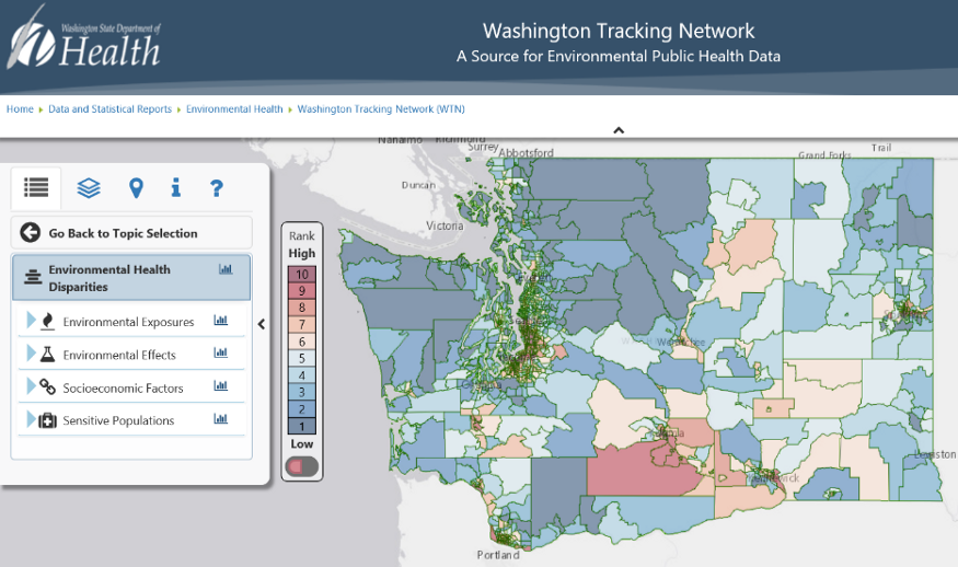
The map has 19 indicators, including air quality concerns such as diesel and ozone emissions, and wastewater discharge. The map also contains population data such as race and ethnicity and those with limited English proficiency. The data includes low birth weight and cardiovascular disease mortality for populations at greater risk.
Communities, lawmakers and state agencies are now using the map to help with environmental justice efforts.
As an example of its use, the Washington State Department of Natural Resources — used the map this year to inform its grant program for the purpose of increasing community tree planning, planting, and management activities in areas of our state with environmental health disparities.
Using the map in the grant process is a concerted effort on their part to include environmental justice in its Urban and Community Forestry program. The program awards thousands of dollars in tree grants every year. They plan to continue to use the map next year for this grant process.
“It was a pleasant surprise,” said Esther Min, about how the map is being used today.
At DOH, the map is an agency tool to help identify and reduce disparities among our state’s residents.
“Our mission at DOH is to work with others to protect and improve the health of all people in Washington State,” said Paj Nandi, DOH’s Community Relations and Health Equity Director. “Providing communities most disproportionately impacted with the tools to help identify health inequities so people’s lives can be improved is part of how we accomplish that mission and help advance health equity. The map serves as an example of collaboration between organizations, academic partners and state agencies, including the Department of Health.”
Anyone can view the map at www.doh.wa.gov/ibl. Once there, select “Environmental Health Disparities” from the left-hand menu.
The tracking network is always looking for feedback, so please email [email protected] if you have comments or questions.
The above is aggregated content from the WA State Department of Health. The Auburn Examiner has not independently verified its contents.


Be First to Comment